United Utilities
Redesigning Bills and Statements
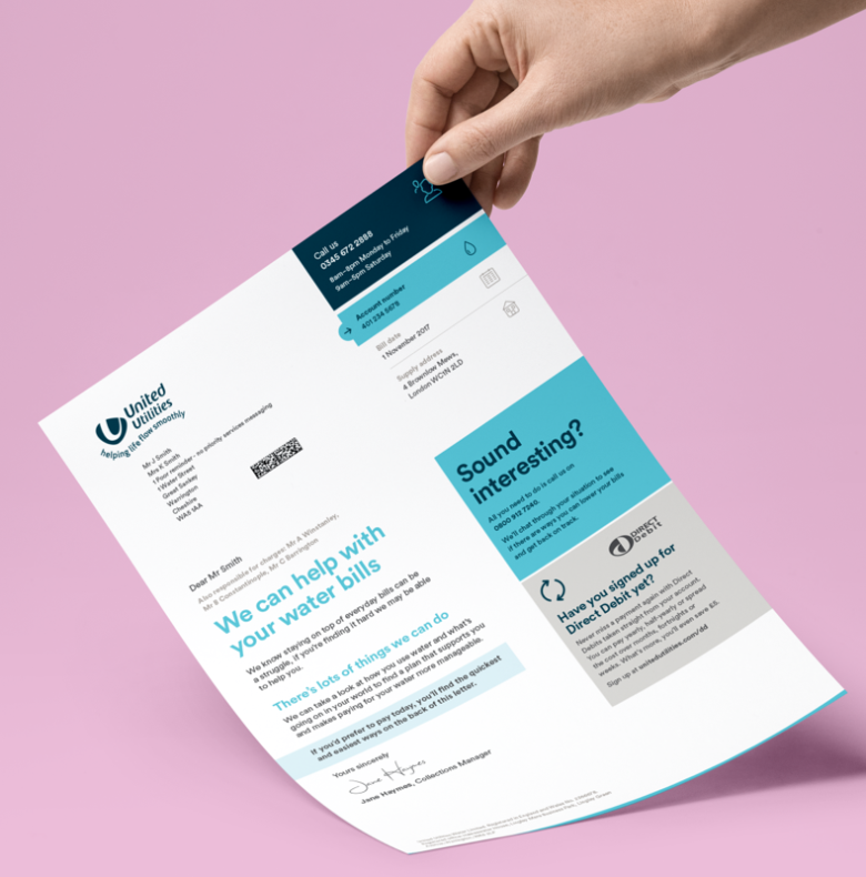
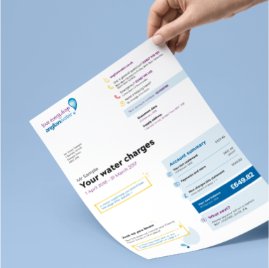
Every detail in plain sight
We worked with United Utilities (a water supplier based in the North West of England) to make its bill as clear as the water it supplies.
We created a flexible and modular solution that accommodates the simplest of bills — and the most complicated.
Skimmers and investigators
There are two types of bill reader. Those who scan the headlines, and those who want to delve into the details to make sure their account and usage are on track.
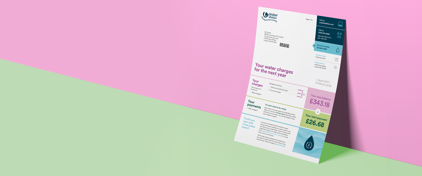
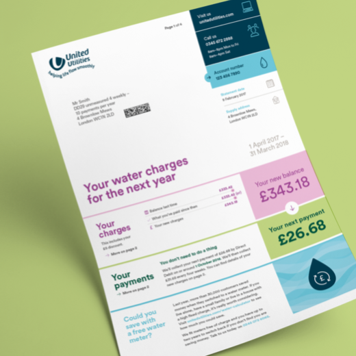
Our bill for United Utilities caters for both, with a front page that surfaces all the key information about usage, charges, and payments in a way that’s digestible in seconds. With detailed breakdowns of everything else over the page.

Navigating the bill
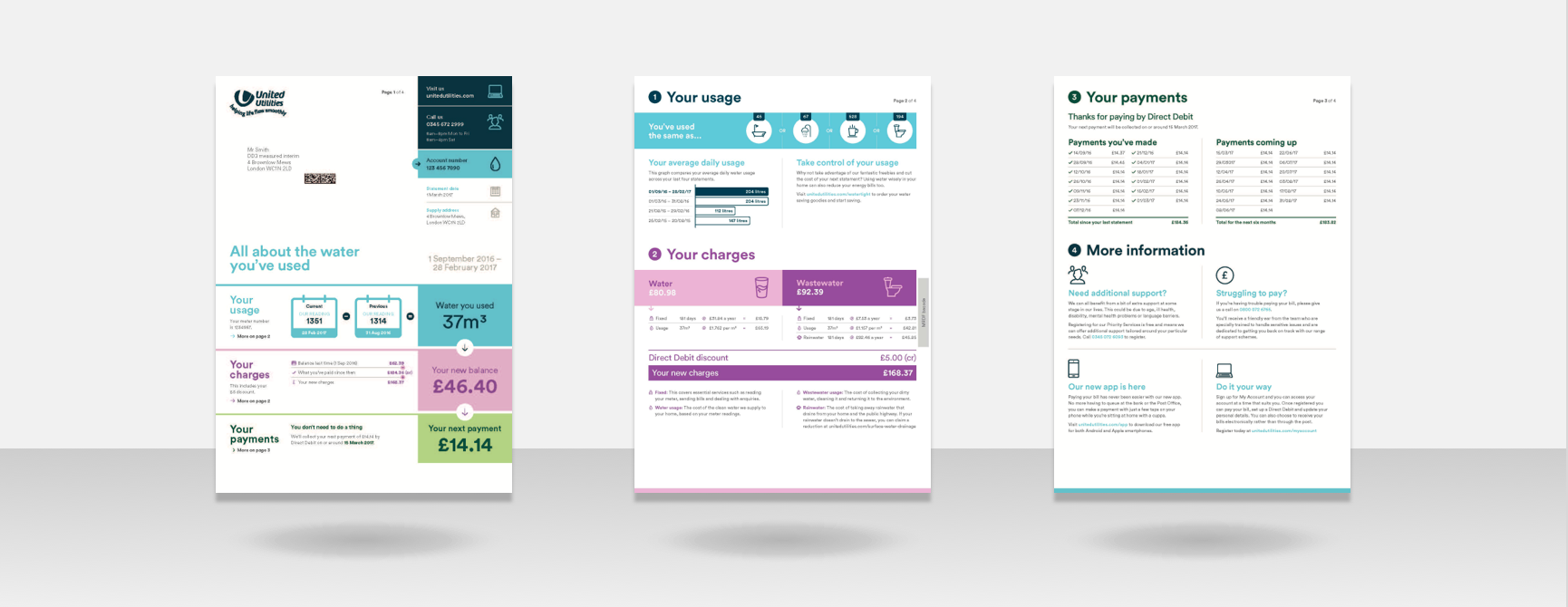
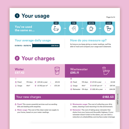
For the ‘investigator’ types, we made sure the bill was easy to search, using numbers and color-coded sections to help them jump through the pages with ease.
We used bespoke iconography and infographics to help people identify and understand data in more complex parts of the bills, like the charges table. Plus, we added a key to provide more detail and context to our suite of icons.

Making homes happier
For some people, water bills can add pressure to an already difficult situation. United Utilities wanted to open up conversations with these people. But without resorting to heavy-handed debt collection letters.
We boosted customer engagement with our Happy Homes sub-brand initiative — softening ‘collection’-style messages and visuals to present a potentially vulnerable group of customers with clear and positive routes out of debt.
See more work
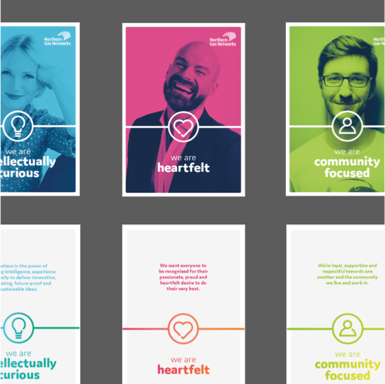
Northern Gas Networks
Connection & Warmth
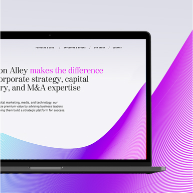
Madison Alley
Investors & Entrepreneurs
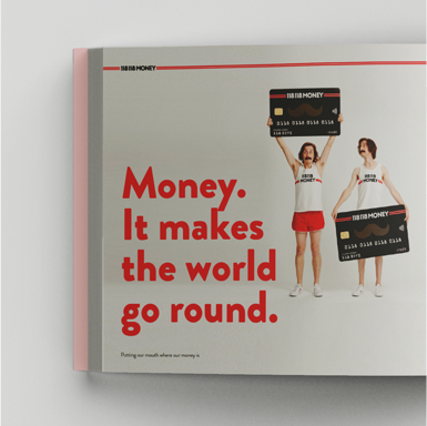
118 118 Money
Positivity & Sensitivity
Anglian Water
Detail & Modularity